Reading 1820 Blogs Daily!


  • a whiter shade of pale
  • Page 1 of 1 ( posts )
May 7, 2023
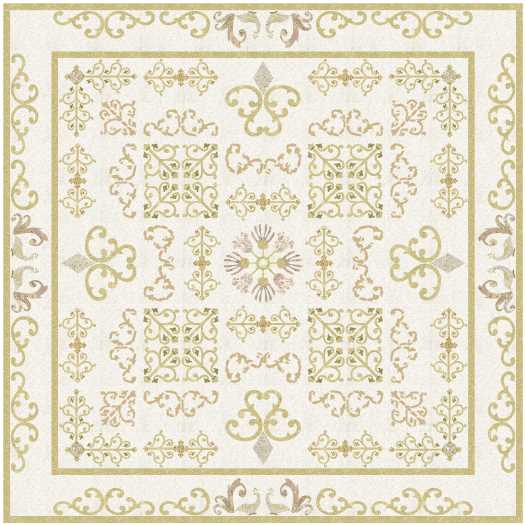
A Whiter Shade of Pale 31, 32 from Virtual Quilter

Minimal colour, but I love the design above.

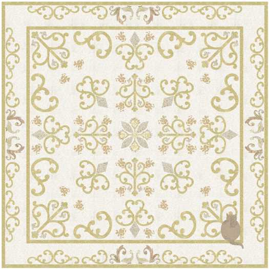
Love the added quilting, but I would be very tempted to use thread very closely matching the background.

Sadly, the quilt is lost, but here is a lovely story of an historical quilt.

read more
July 13, 2021
A Whiter Shade of Pale 29, 30 from Virtual Quilter

Love the idea of a very low contrast quilt like these, but I don’t think I want to live with one.

At least that saves me the task of picking out one design to make!

read more
February 8, 2021
A Whiter Shade of Pale 27, 28 from Virtual Quilter

A very restful design … which is my excuse for not using the background fabric in the corners … I must have had my eyes closed!

Still blank corners, and I quilted over the cat!

read more
August 24, 2020
A Whiter Shade of Pale 25, 26 from Virtual Quilter

Not quite a wholecloth quilt, and I love the idea of using very low contrast fabrics for a subtle effect.

I haven’t chosen a design to make, but I have started to collect pale, faded fabrics. This could be a long term part of the project, as there are other fabrics which I just might need in my stash too!

read more
March 10, 2020
A Whiter Shade of Pale 22, 23, 24 from Virtual Quilter

I love all three of these designs … low contrast is restful, which is what we need in a bedroom. The cat agrees.

I love using plain squares in designs, which gives our eyes a place to rest, as well as being spaces where the quilting will show up well.

As I said earlier, I love them all, but the last one is my favourite.

read more
October 15, 2019
A Whiter Shade of Pale 21 from Virtual Quilter

Getting the contrast right in any quilt is harder than choosing colours … low contrast would be harder, but I love this design.

read more
  • a whiter shade of pale
  • Page 1 of 1 ( 6 posts )